For a number of years, I have been managing a small team of data analysts and engineers with a mandate to inform on innovation economy activity in Canada. Data that we work with involves surveys, data vendors and publicly available data sources, all within a ‘data partnership’ model.
While our team was generally doing good work and providing critical analysis, a few years ago we ran into some issues. Challenges that would come up regularly:
- Missed deadlines due to difficulty estimating how long tasks would take.
- After publication, occasionally going back and revise results more than we would like.
- In the background, there was sometimes a feeling of not quite hitting the mark in regards to delivering a high level of business value.
These sound like classic project management problems and for that we turned to project management solutions. This included the adoption of Agile. We added Kanban and Scrum into the mix, with daily stand-ups to identify blocks and relay progress.
Keep in mind, we are not a software development shop, we are a data science and analytics team. So, we were not exactly the perfect example of where these techniques have really been refined. Regardless, we met with some success and managed to improve our processes. However, we also discovered parts of our process where Agile plugs neatly in to our data pipeline, and other places where it was less of a ‘fit’.
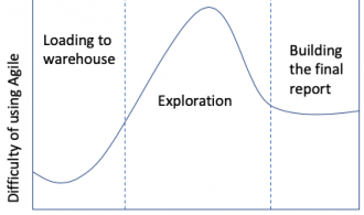
In the diagram below, you can see the relationship to using Agile techniques to data analysis. This diagram is conceptual and based off my own anecdotal experience, but I think it outlines the concept nicely.

For showing our data pipeline, I highlighted three main sections: The first being getting and loading the data. Most of the data cleaning sits here. The second section is data exploration and most of the analysis. The final section, there is the final report and visuals.
Of course, this is pretty simplistic and doesn’t consider scenarios like going back to the beginning if certain questions that we expected to answer cannot be answered. Also, I wouldn’t misconstrue these sections as “easy” and “hard” in and of themselves, but rather that some are more appropriate to Agile adoption than others.
To summarize the concept, the biggest stumbling block to data exploration are the following:
- Time estimates are the hardest to nail down when you are exploring the data. This is because you cannot always tell what you are going to find, and can potentially run into a number of roadblocks if the story does not emerge.
- Furthermore, if your primary stakeholder is not a data person, he or she will struggle to provide feedback at this stage of the game.
This is in contrast to the first section: loading data, while having some surprises, is often easier to estimate and a clearer ‘definition of done’ than the second section.
The final section, writing the report, it gets easier again. This is because the report can be broken out into sections, each section can be treated like a user story and be road test according to Agile techniques more easily. Also, getting report sections in front of a stakeholder is easier for this person or people to wrap their heads around.
Where did we land in the end? It depends on the stage and the type of project (not all of them are reports) but mostly we endeavor to follow an ‘Agile mindset’ and apply parts of it where it makes sense. We definitely feel positive about it and do not regret applying these techniques to our workflow.